Introduction
UI Customization
User Interface is written in React with TypeScript, using Next.js framework and exported as static page. User Interface files are stored in ./out directory under Local Server. Any User Interface customization requires replacing content of ./out directory with your own content. If you want to create something completely custom, you can use Controller library to create User Interface from scratch, however, there are several ways to customize only desired fragments of existing User Interface, saving a lot of time and effort. Below you can find hints on how to customize default user interface.
Setting up project
All JavaScript-related code is stored in stargate-js-mono repository, under stargate-system organization. It is recommended to create a fork of this repository to be able to sync any future updates, but if you are not familiar with git, or you don't plan long term support for your project, you can just clone or download repository. Once you have a copy of the repository on your disk, open repository root folder in terminal and run npm install, then npm run build
Code of User Interface exists under ./apps/UserInterface directory. To be able to see changes you make in real time, start development server by running npm run dev command in terminal. Server will be available on localhost:3000 - please note: you need to have your Local Server running on same physical machine as development server for proper connection between them. If you don't have Local Server running already, you can start the one from repository, running npm run start:server command.
Once you finish implementing your changes, it's time to move new version of User Interface to destination server. Run npm run build:ui command to export current version of User Interface to static page (files will appear in ./apps/UserInterface/out directory). When exported successfully, replace existing ./out directory within your Local Server with the one generated under ./apps/UserInterface. From now on, your Local Server should serve your custom version of User Interface.
Common use cases
Customized Device
One of typical use cases where you might want to customize User Interface is when your device is something more sophisticated than just series of independent inputs and outputs, i.e. some values should be modified together using some algorithm, their layout within Device component should reflect physical or logical interconnection between them etc. In Examples section you can find Customized device example which fulfills such scenario (controls RGB Led with single ColorPicker input, instead of 3 independent numeric inputs).
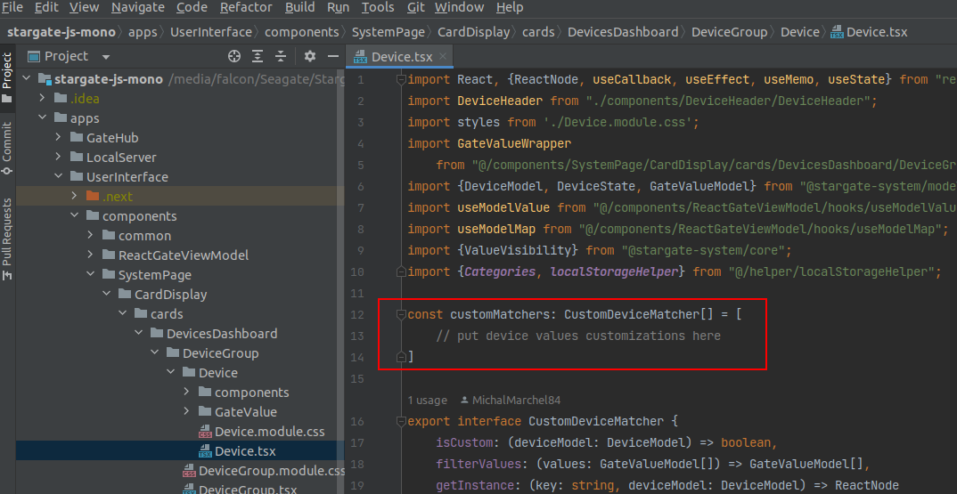
Although you can modify User Interface in any way you find appropriate, there is a simple mechanism of modifying Device content already implemented within default User Interface. In general, you need to create your own custom component to display the content as desired, prepare an object implementing CustomDeviceMatcher interface and add this object to customMatchers array located in Device.tsx file (under components
Although you can modify User Interface in any way you find appropriate, there is a simple mechanism of modifying Device content already implemented within default User Interface. In general, you need to create your own custom component to display the content as desired, prepare an object implementing CustomDeviceMatcher interface and add this object to customMatchers array located in Device.tsx file (under components
CustomDeviceMatcher contains functions that allows Device component to find Gate Values that should be displayed in a custom way and display them using custom component instead of default one. To properly implement CustomDeviceMatcher interface, you need to define 3 functions within an object:
isCustom: (deviceModel: DeviceModel) => boolean
Function will be called for each device within System Model to determine which devices should be displayed with use of custom components. Device will be considered custom if function returns truedeviceModel - model of given device
filterValues: (values: GateValueModel[]) => GateValueModel[]
Function to filter out Gate Values that will be displayed by custom component. Values returned will be displayed with use of their default componentsvalues - Gate Value models of given device
getInstance: (key: string, deviceModel: DeviceModel) => ReactNode
Function that should return custom component instancekey - value to be set as key prop of returned instance
deviceModel - model of given device
Custom Card
Another typical situation is when some of your devices forms a sub-system that should be displayed completely different than just simple series of devices, or one of your devices has so unique characteristic that you want to display it separately in a custom way. In Examples section you can find Custom card example that shows ColorPicker component from Customized device example as custom card.
As shown in example, to add custom card, you need to prepare custom card component. To feed your component with data, use SystemModelContext to get System Model (see Controller reference to find out more about System Model usage).
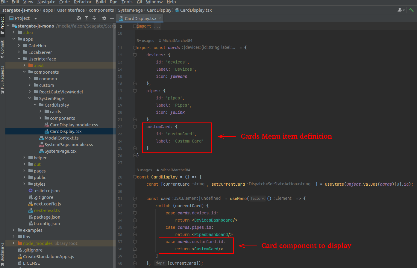
To make your card component visible and accessible on Cards Menu, add menu item definition to cards object and component you want to display to switch-case statement within CardDisplay.tsx file (under components
As shown in example, to add custom card, you need to prepare custom card component. To feed your component with data, use SystemModelContext to get System Model (see Controller reference to find out more about System Model usage).
To make your card component visible and accessible on Cards Menu, add menu item definition to cards object and component you want to display to switch-case statement within CardDisplay.tsx file (under components